Sunday, July 31, 2011

Overlapping Gates

I spied these gates as we dashed across a street, intent on making our way to our luncheon destination. The unusual structure of the gates made me stop. They are panels that fold back upon themselves. They stand in the shadows all day long, flattened against the wall, taking up very little sidewalk space. At night, the gates close up over the storefront. It's a Victorian security measure that is so much more attractive than the modern "garage doors" pulled down over newer stores. Look at the way the two panels share the same design. One shifts a little to the side. The overlapping, sightly offset lines of wrought iron form a new design. Tracing paper...sheer fabric...I want to play with this.

Sunday, July 24, 2011

Macarons

I tasted my first macaron in Paris, sitting inside Laduree, the gilded jewel box of a café near the Place de la Madeleine. The removal of an O defines the difference between an American macaroon and a French macaron. Two airy meringues sandwiched together with a jam or buttercream filling, macarons are delicate, a confection baked by angels. Chocolate, pistachio, strawberry, raspberry, violet, and rose---these traditional flavors give macarons their pastel tints, although you can find them in licorice, wasabi and fois gras flavors. I walked past this display of macarons in London. The themes of tea, chocolate and desserts continue to hold my interest. Perhaps it is their combined elements of tradition and fantasy. I know exactly what colors I want to work with this week.

Sunday, July 17, 2011

Antiques Shop

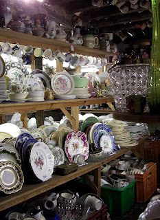
I descended the steep wooden stairs to the basement of the antiques shop. Shelves lined the stone walls and filled the rest of the space with just enough room to walk---very carefully---between them. Plates, pitchers and glassware crowded the shelves. Teacups hung from the rafters. Lidless sugar bowls and assorted tchotchkes lurked in bins on the floor. A cursory glance might bring to mind the sad scene of a hoarder's home. But no, that's not what this was. Sets were stacked, like with like. Price tags with carefully-written descriptions clearly indicated the owner's willingness to part with the Spode or Royal Winton. Too much stuff is not necessarily a sign of an illness. It could simply indicate a collector whose energy and enthusiasm outmatches the current pool of potential buyers.

Sunday, July 10, 2011

Ledbury In Black and White

The town of Ledbury in Herefordshire boasts a fine collection of Tudor-era buildings. Known as "Black and Whites," they are a graphically arresting, ridiculously flamboyant sight. The timbers form stripes, grids and herringbone patterns. Everything is a little wonky, with crooked doors and walls that lean outwards. Choose any small section of a building and you have what looks like an improvisationally pieced quilt. Look at the varying textures of the white sections. Oh, what inspiration! I have always admired Elizabeth Barton’s quilts. Now I understand them a little better, having communed with the Black and Whites. Elizabeth grew up surrounded by the vernacular architecture of England. But her initial inspiration can lead to anything from a recognizable landscape to a complete abstraction. What inspires you and where will it lead you?

Sunday, July 3, 2011

Decorated Windshield

How could I NOT stop and take a photo of this car? And I'm glad that I did, because it was gone when we came back out. Certain shapes, patterns or design arrangements appear over and over in different parts of the world or at different times in history. The dots and wiggly lines on this car could have come from an Australian Aboriginal painting. The urge to decorate, to embellish, to display, to create, is something that all humans have in common. Our world is happier because of it.